My portfolio... kinda

Welcome to my portfolio—well, sort of! Due to contractual obligations with my current employer, I’m unable to showcase most of my work from the past seven years. Instead, I’ve crafted a detailed breakdown of the design choices behind this portfolio site, including its logo and overall structure. Read on for an inside look at my creative process and how I approach design from the ground up!

BarkBox Landing Page Dupe

Design approach:

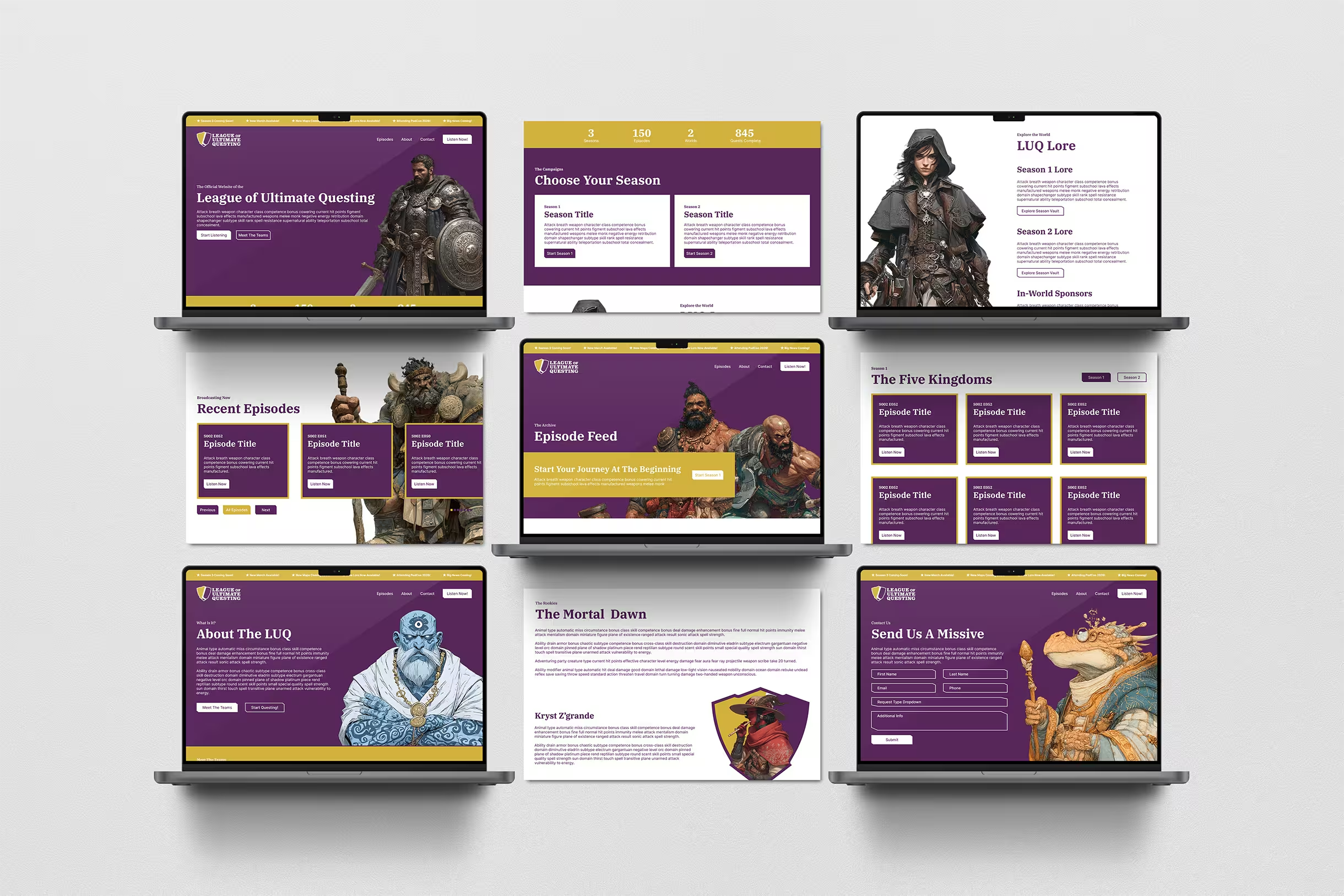
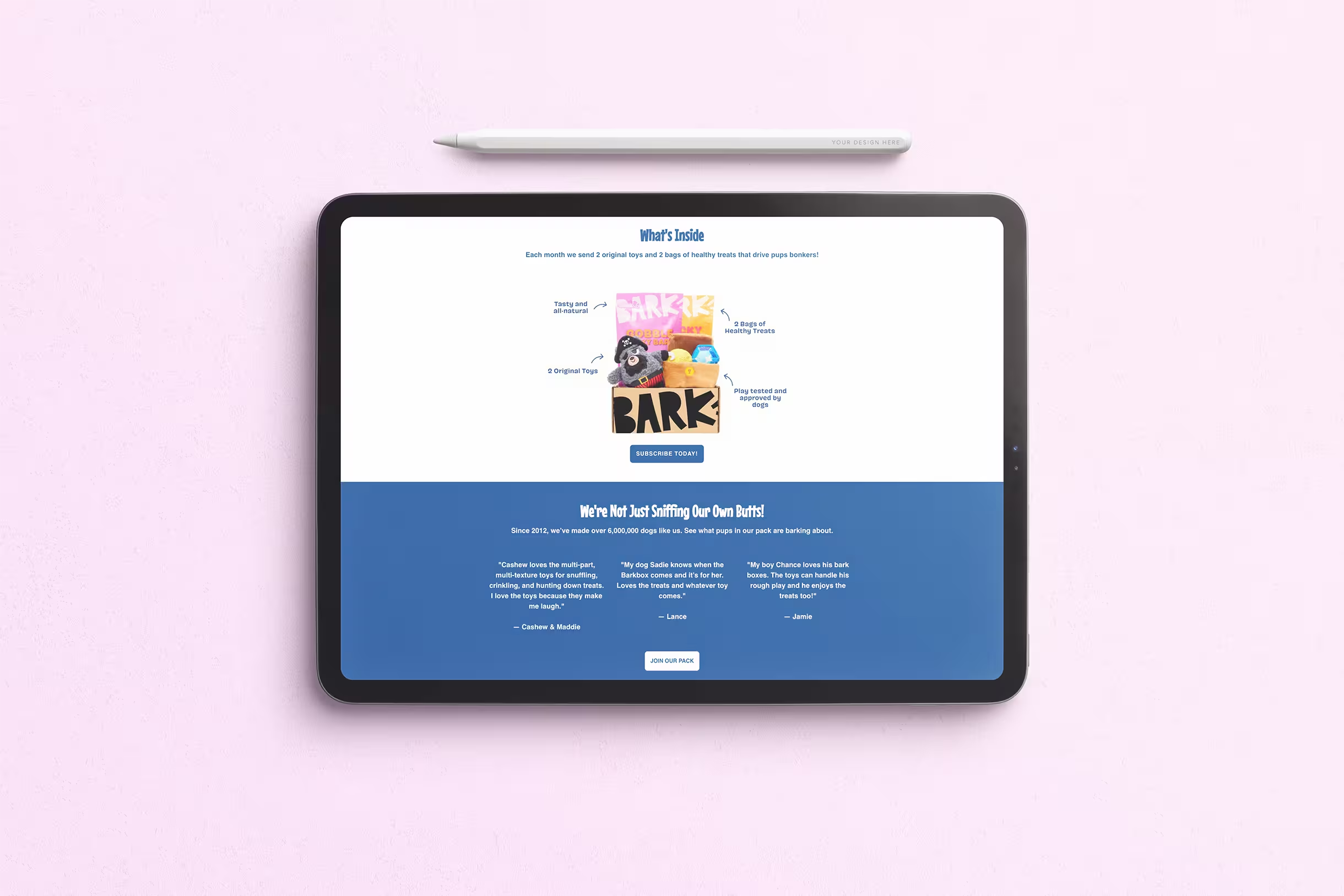
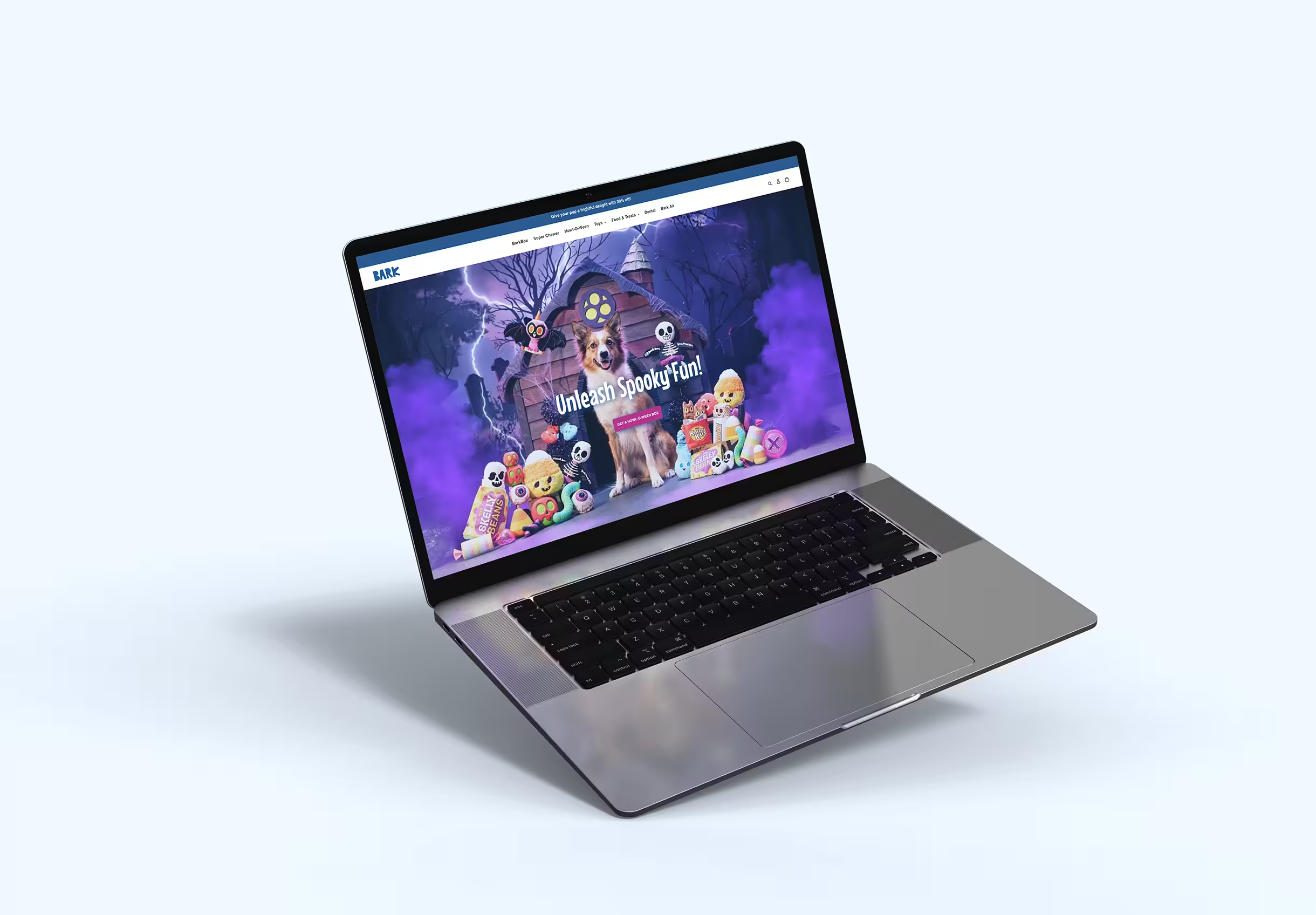
My primary goal was to quickly enhance the original page's user experience and interface for desktop, focusing on improving usability and visual design. Without access to Bark's theme or assets, I relied on Shopify’s tools and creative coding to craft a comparable experience. I worked to simplify the layout, improve interactivity, and create a cohesive look in line with their current holiday campaign—all while retaining BarkBox’s playful tone. The project took about three hours, and I intentionally did not optimize for mobile viewing, as I would in a full-scale project.

You can view the project here using the password: barkbox

Challenges & Solutions:

Theme Restrictions: Without the original theme, replicating the exact design was a challenge. I focused on key enhancements like making buttons more visible and streamlining information flow for clarity.

UX/UI Enhancements: Using Bark’s brand colors and imagery, I improved accessibility by refining font sizes and contrast. All call-to-action buttons are strategically positioned to drive engagement, which is crucial for landing pages.

Customization: I reorganized the layout to showcase key content—such as product details and CTAs—upfront, ensuring a smoother user experience without overwhelming them with too much information.

Outcome:

While not an exact replica, this page captures the spirit of BarkBox with improvements to usability, such as more prominent action buttons and a cleaner layout. It functions well as an e-commerce landing page in Shopify, prioritizing conversions through clear, user-friendly design. You can view the project here using the password: barkbox

New Portfolio Logo Development

Design approach & goals:

With the desire to better showcase personality and a more hands-on design aesthetic, the new logo takes a whimsical and hand-drawn approach, breaking away from the more conventional, corporate feel of the original. This shift emphasizes Wyatt’s love for creating things from scratch and a desire to reflect a more personal, approachable brand identity.

Features to elevate this new design:

Hand-Drawn Element: The new logo clearly reflects Wyatt’s artistic roots. The hand-drawn look embodies his creative journey that started at a young age, literally illustrating his passion for the process of designing from the ground up. This is a crucial reflection of personality that the original clean-cut design didn’t convey.

Whimsical Design: The use of whimsical, soft, and playful typography adds character. It captures the fun, dynamic energy that Wyatt brings to his work, giving potential clients a feel for his unique creative vision.

Typography Breakdown: The bold, rounded letters have a human touch, which gives it personality and vibrancy. The quirky alignment and playful typeface choices further express individuality.

Visual Hierarchy: The new design uses a clear visual hierarchy with "WYATT" placed prominently, making the personal aspect of the brand stand out. The bold nature of the letters also grabs attention immediately.

Scalability: Despite the playful design, the new logo is still scalable, meaning it will look good on both a business card and a large banner.

Memorability: This whimsical logo is far more memorable than the original. Its distinctive shape, color, and playful aesthetic make it easier to recognize and recall.

Wordmark

Header

Icon

Initial

Conclusion:

This new logo showcases Wyatt's personal design philosophy and artistic roots, delivering a fun, approachable, and creative identity that better reflects who he is as a designer. By embracing a more whimsical, hand-drawn aesthetic, the logo not only captures his passion for creating but also sets a playful tone that resonates with his target audience.

New portfolio website development

Design approach & goals:

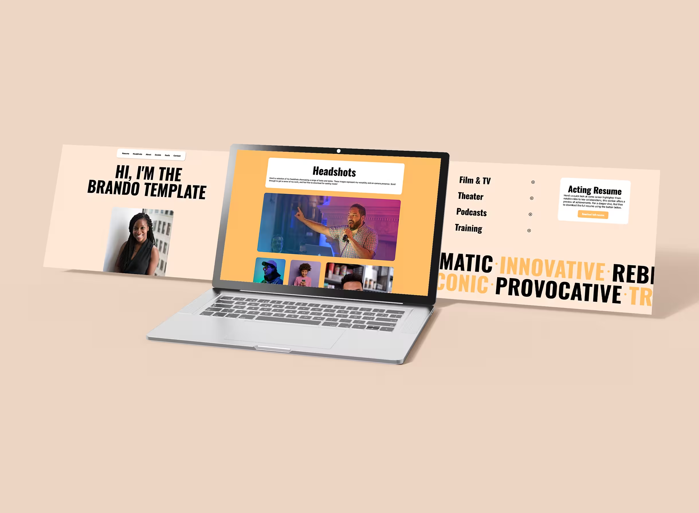
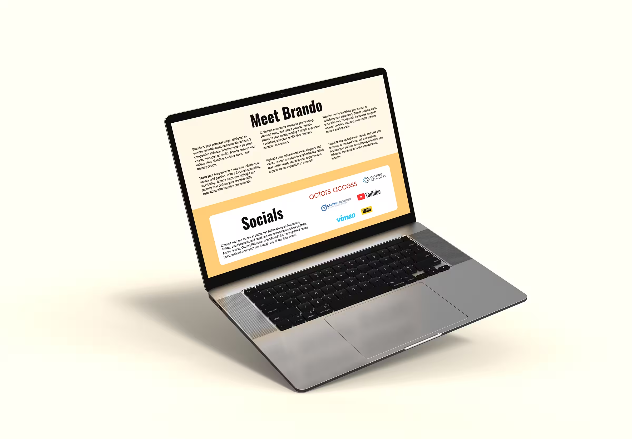
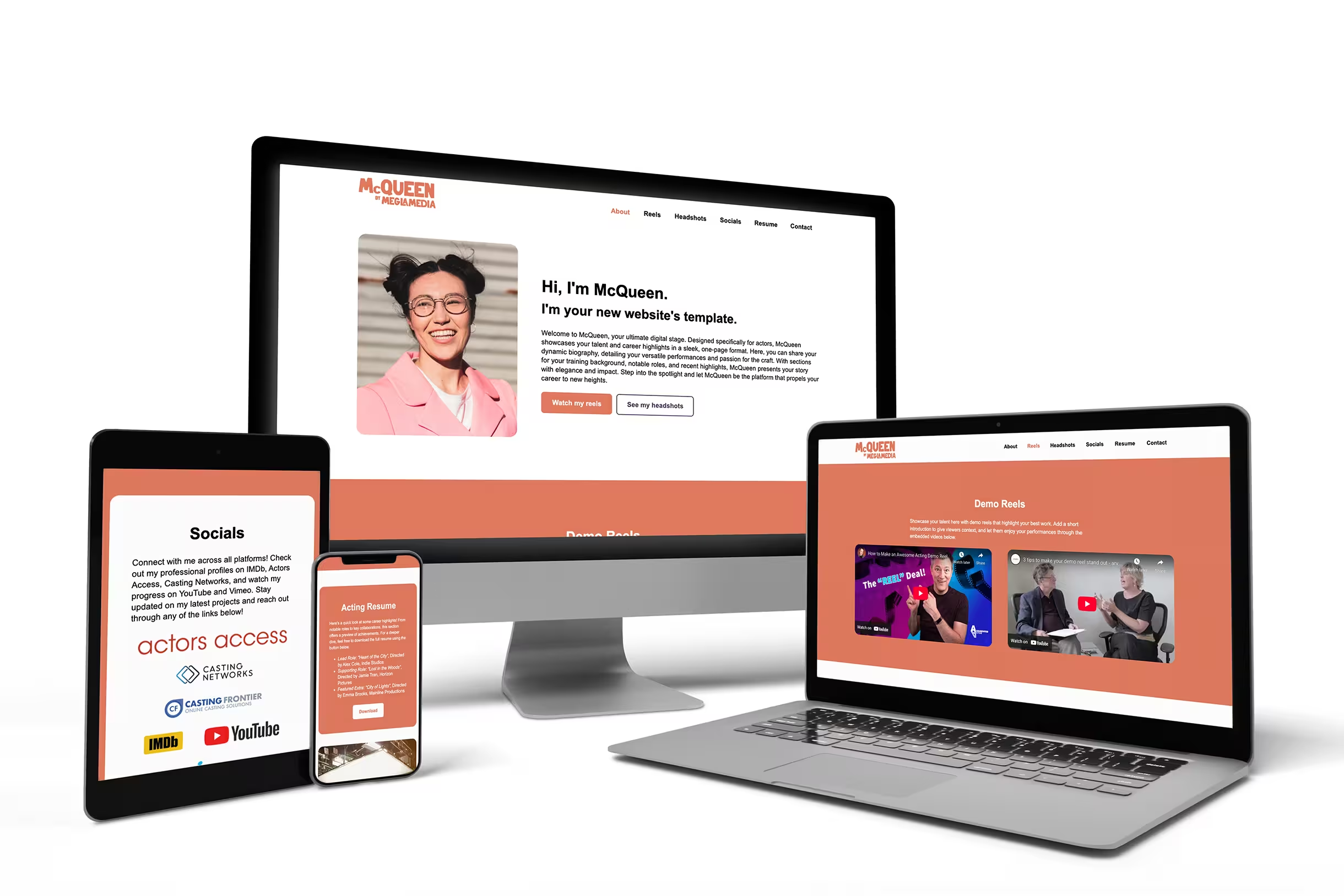
The design goals of focus on creating a user-centered experience by ensuring intuitive navigation and clear calls to action, making it easy for employers and collaborators to access essential information like Wyatt's resume and contact details. The design showcases Wyatt's creativity and personal touch through hand-drawn elements and a playful tone, reflecting his love for building things from scratch, while maintaining a professional appearance. The minimalist and modern aesthetic prioritizes readability and usability with clean typography and spacious layouts, keeping the focus on Wyatt’s story and design approach without overwhelming visitors. By breaking down his design choices, Wyatt turns the portfolio into a live demonstration of his versatility in web design, while subtle visual cues and interactive elements optimize engagement, encouraging visitors to explore and connect. All of these elements work together to present a cohesive portfolio that highlights Wyatt’s professional expertise and personal brand.

Key strengths & highlights to elevate this new design:

Clear Branding: The site uses a custom-designed logo that showcases Wyatt's whimsical, creative side. It reflects his hands-on approach to design and his deep love for starting projects from scratch.

Cohesive Visual Identity: The site's color palette and typography are consistent across all pages, ensuring a unified look that aligns with Wyatt’s personal brand.

User-Friendly Navigation: Simple, clean layouts make it easy for users to find information. Each section, from About Me to Portfolio, feels distinct yet cohesive, with smooth transitions that guide the user experience effortlessly.

Balancing Professionalism with Personality: Wyatt does a great job of balancing professionalism with personal touches. The casual, approachable language throughout the site makes him relatable while still highlighting his significant professional accomplishments.

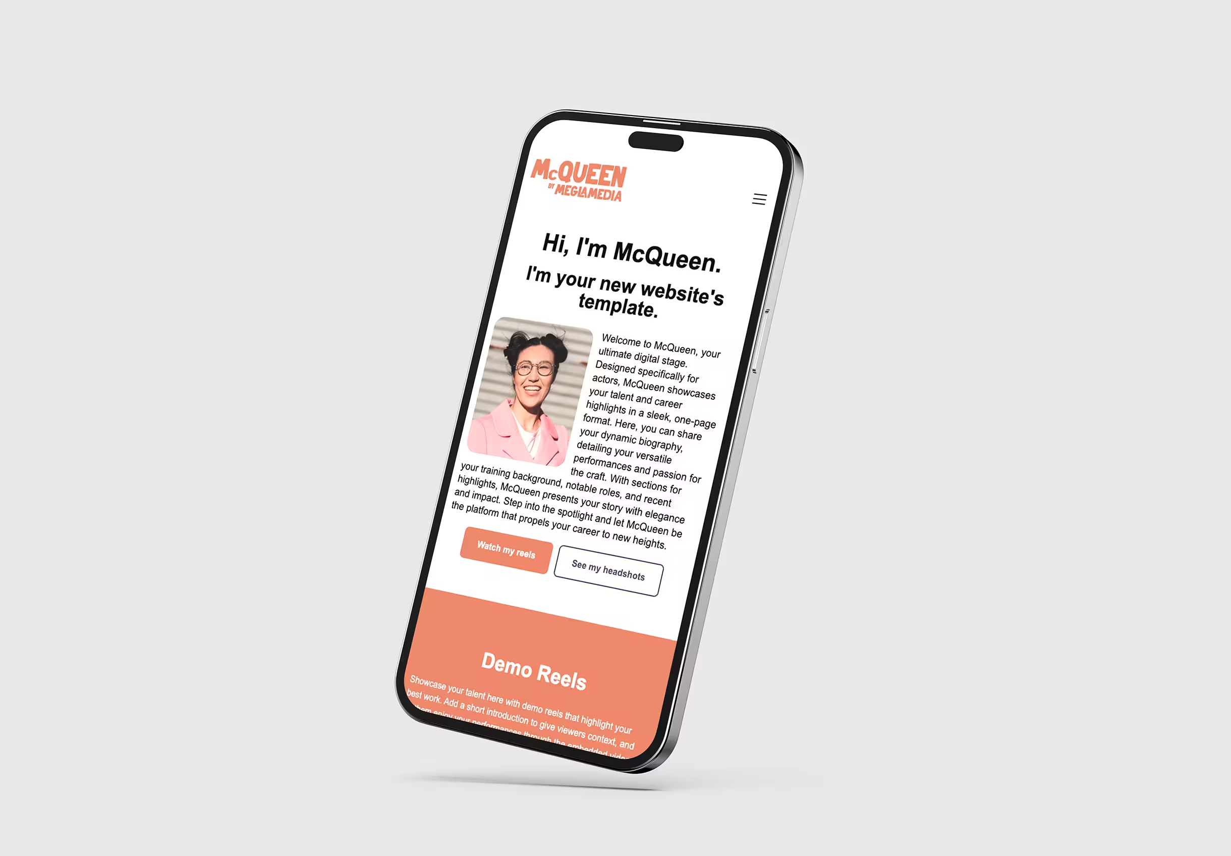
Responsive Design: The site is optimized for various devices, ensuring that the user experience is just as strong on mobile as it is on desktop.

Portfolio Case Studies: Since contractual obligations prevent Wyatt from showcasing his previous work, he effectively uses his own logo and site as case studies to demonstrate his design process and technical abilities.

Expanded Resume Page: This feature allows potential employers or collaborators to dive deeper into his experience, with the option to download a PDF version for convenience.

Strong Calls-to-Action: The contact page and clear, consistent CTAs make it easy for users to reach out, keeping engagement high.

Color Palette

Elements

Conclusion:

The overall design and structure o align seamlessly with Wyatt’s core mission: to showcase his creativity, professionalism, and versatility. The thoughtful use of design elements, consistent branding, and strong messaging create a cohesive portfolio that tells a story, even without the presence of external client work. This site is an excellent example of how limitations can spark creative solutions, turning Wyatt’s personal logo and website design into a meaningful showcase of his abilities.

Content & designs created with the help of AI
© 2025 Megla Media, LLC